Die Farbe hat mich. Ich brauche nicht nach ihr zu haschen. Sie hat mich für immer, ich weiß das. Das ist der glücklichen Stunde Sinn: ich und die Farbe sind eins. Ich bin Maler.
Paul Klee – Tagebuch
As an unwavering admirer of the Impressionist movement in the history of visual arts, I found myself a little bit perplexed when, through a strange string of accidents, I came across another biography of the Taschen edition, this time dedicated to a painter whose bold highlight of shape and colour I find nothing short of prophetic, yet I feel strangely detached from the trysts of rigid logic with high-flown imagination pervading his style.
The artworks of Paul Klee make it almost impossible for one to square them into the boundaries of an art movement, and for me personally also hard to interpret, since very often I found myself struggling in trying to get hold of a secret clue that would unlock the meaning of a painting for me. More often than not I ended up with none, having to rely solely on my intuition and feeling to guide me through the splendid maze of his secrecies and allusions.
Die Farbe ist erstens Qualität. Zweitens ist sie Gewicht, denn sie hat nicht nur einen Farbwert, sondern auch einen Helligkeitswert. Drittens ist sie auch noch Maß, denn sie hat außer den vorigen Werten noch ihre Grenzen, ihren Umfang, ihre Ausdehnung, ihr Meßbares. Das Helldunkel ist erstens Gewicht, und in seiner Ausdehnung bzw. Begrenzung ist es zweitens Maß. Die Linie aber ist nur Maß.
Paul Klee – Vortrag, Januar 1924
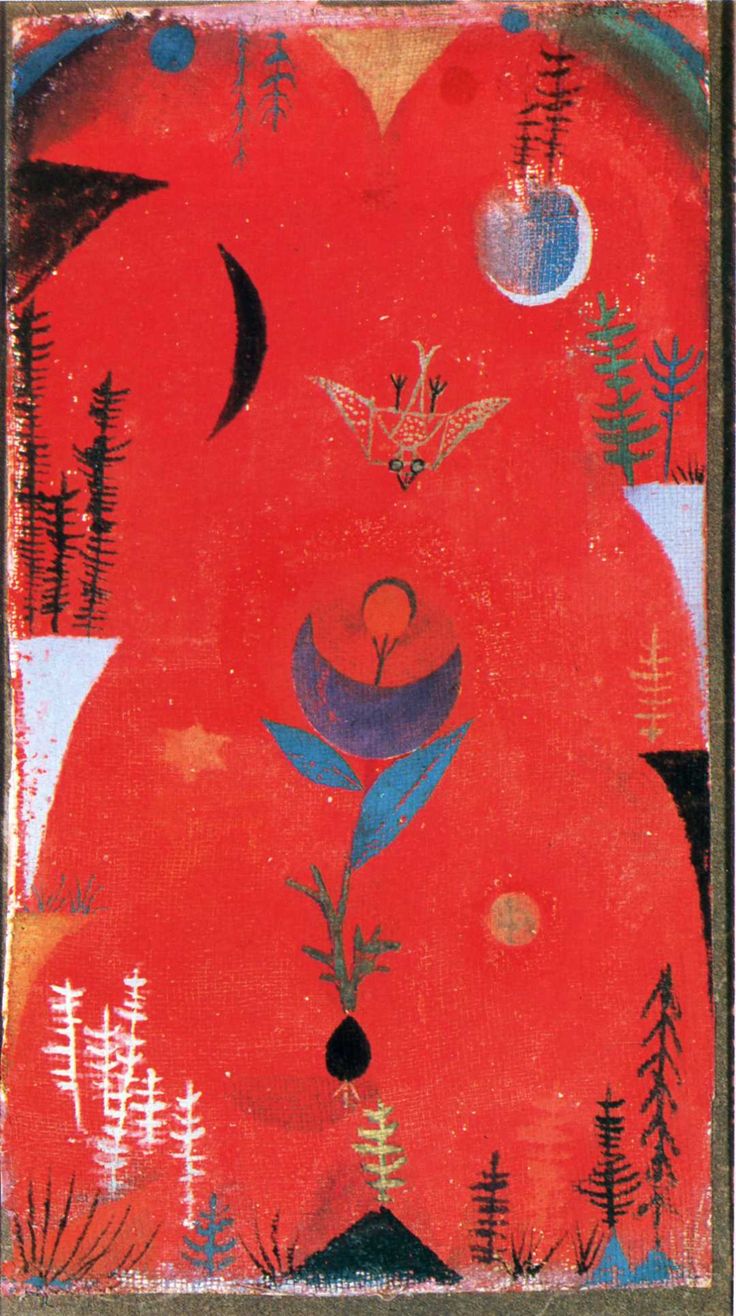
Despite the occasional inconsistency of delightful exploration I saw myself subjected to, one pronounced trait of Klee’s paintings was fully capable of wringing peals of admiration from me, that being the artist’s audacious exertion of his natural propensity for colour and its experimental usage over all of his artwork, which sometimes reminded me of the timbres of sound one is able to extract with much lyricism from a musical instrument.
Considering Klee’s initial indecision when it came to choosing a life path between music and the visual arts, it is only natural that the one should, to a degree, transmute into the other, thus finding its voice in colour instead of a music hall.
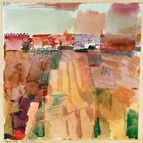
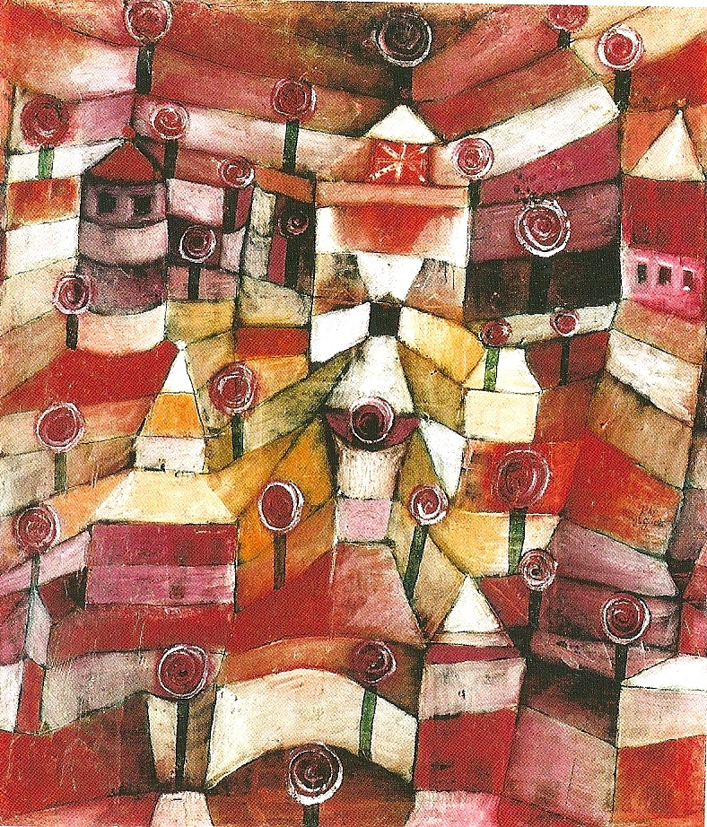
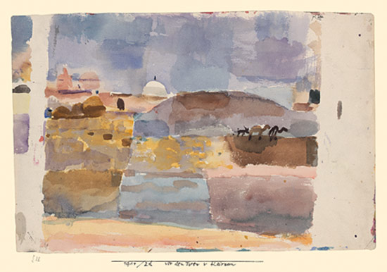
The demonstration of his amazing sensitivity for colour I consider to be his Kairouan aquarelles, created during a visit in Tunisia in 1914. The lightness and vibrancy of the shades applied say much of his exploration of light and its play upon the city.
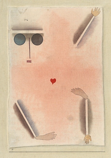
The return from his voyage saw Klee’s subsequent drifting off into the lands of the abstract, where nature and objects of solidity lose rapidly in their importance, and a heavy emphasis on shape gains the forefront in the artist’s work instead. While the application of colour builds a steady tension with each completed artwork like a bridge across the gulf between his early works and his blooming maturity, the land of the abstract was precisely where I had to start fishing for clues and innuendos that would propel me to unveil the chromatic mystery of Klee’s paintings, pastels and aquarelles.
Kunst gibt nich das Sichtbare wieder, sondern macht sichtbar. Das Wesen der Graphik verführt leicht und mit Recht zur Abstraktion. Schemen- und Märchenhaftigkeit des imaginären Charakters ist gegeben und äußert sich zugleich mit großer Präzision. Je reiner die graphische Arbeit, das heißt, je mehr Gewicht auf die der graphischen Darstellung zugrunde liegenden Formelemente gelegt ist, desto mangelhafter die Rüstung zur realistischen Darstellung sichtbarer Dinge.
Paul Klee – Schöpferische Konfession, 1920
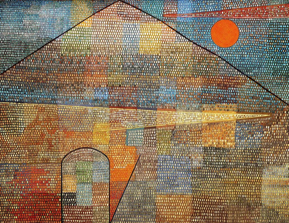
One of my definite favourites was Ad Parnassum, representing the peak of Klee’s artistic powers influenced by his travels to Egypt in 1928, and this mosaic closely following the effervescent style of pointillism aptly illustrates and summarizes what I admire about Klee’s work most – a strong sense of colour boldly underlined by an inventiveness of shape, creating a unique experiment that eventually grasps one by the senses, inviting into the discovery of a highly individualistic expression.